By Mabel Wellman.
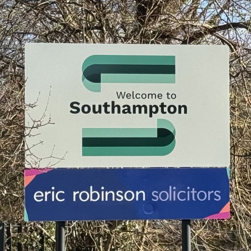
The new Welcome To Southampton signs have recently been unveiled, replacing the previous signs which have remained the same for decades.
This change has not been well received by many people in Southampton.
The previous signs, which warmly exclaimed “Welcome to Southampton” with an image of a ship celebrated Southampton as an “international maritime city”, which is said at the bottom of the signs.
The new signs also say “Welcome to Southampton”” and feature what some could call a “modern” choice of colours and shape to frame the words. In an attempt to give the new sign justice, you could say the shape used in these shapes could actually be oil tankers, with the green-blue colour choice reflecting the water that flanks the city with the River Test, River Itchen and Southampton Waters; but this could be such a stretch I’m actually worried to write that in case the designers and defenders of the new signs say that’s what they were thinking all along.
The new signs lack any character whatsoever. We are a city with many landmarks, memorable buildings, historical associations, and so much more. Of course, nobody likes a crowded sign which could confuse people, but there are just so many more options or approaches that could have been taken with the colour and design to make a truly welcoming message to people entering the city. Instead, this new sign could say welcome to any town or city and it would be equally plain.
The old signs will always be something I love. I’ve seen them since I was growing up, sitting in the back of my parents’ car, I’d get excited seeing the ship on the sign and know how historically important our city is. After a long day going somewhere new, or now as an adult a long day of work outside the city, these signs would tell me that I was home. The new cold corporate signs, just do not invite those same warm feelings.
Many people do also criticise the price of this rebrand. It has been revealed it cost the city £80 thousand to do this rebrand with the aim to “potentially unlock billions” of pounds in new jobs, money spent and other forms of investment. Many people have said that this money could have been better spent on other investments such as helping to keep streetlights on; helping home people on the streets and much more. It would be interesting to see what data there is which made the council think this rebrand was necessary, compared to other forms of investment in the city to help our economy – and if the design chosen is the best to help unlock these billions of pounds.
Almost a decade ago, Southampton held a competition in schools to design Southampton’s flag. I am a bit disappointed that the artists of Southampton, both young and old, could not bid to design these welcome signs. A portion of the money paid for the design could have been used as prize money, with thousands of designs to choose from.
This could have supported local artists and our local history and bring the community. Instead, we have a boring font, and maybe an oil tanker or two of a shape if you squint your eyes and tilt your head at the right angle.
- In Common is not for profit. We rely on donations from readers to keep the site running. Could you help to support us for as little as 25p a week? Please help us to carry on offering independent grass roots media. Visit: https://www.patreon.com/incommonsoton

